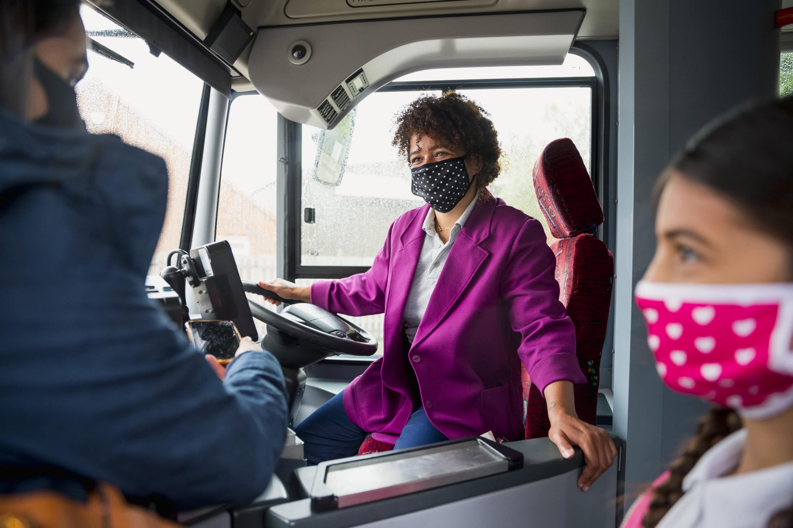
Contrary to what some people may think, user experience in Public Transportation starts before passengers actually start the ride on the vehicles and ends after the transportation itself. In order to guarantee a successful transportation service, it is crucial to focus on the whole experience of passengers, from the moment they arrive in terminals to the moment they reach their final destination.
At Optibus, people in all departments work to make public transportation better. Together. In the following blog post, our very own Ilana Zeigerman, who is not only Marketing Coordinator at Optibus but also an Architect and Urbanist, shows why one of the most effective ways to improve the mobility hub is by investing in local design. This article presents a case study demonstrating the impact of architecture on our common goal: Improving the passenger experience.
A 52,000 sqm secret has been hiding in the heart of Brazil’s capital for 63 years. Located in Brasilia’s main bus terminal, Plano Piloto station, this huge space was created when Brasilia was built in 1960. Until today, it remains largely unknown, yet is key to unlocking a higher quality public transportation experience.
As an architect, urban planner, and native of Brasilia working at the public transportation start-up Optibus, I believe that the biggest failure in the design of public transportation terminals is to plan them as places for vehicles, rather than passengers. High-profile projects, such as Grand Central Madison in New York City, and the success of King’s Cross in London, prove that a good mobility hub not only enables connectivity, it also contributes to a positive public transportation experience. That’s because the passenger experience begins before, and ends after, the ride itself. In order to boost ridership, investing in the architectural design of public transportation spaces is key.
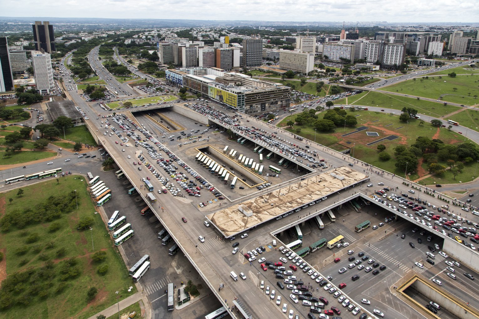 Brasilia’s main bus station, Rodoviária do Plano Piloto. Credit: Victoria Camara, Wikipedia.
In Brasilia, approximately 800,000 people and 3,800 buses pass through the city’s main bus terminal, Plano Piloto station, every day. For passengers, one of their biggest concerns is personal safety. Four hundred and sixteen criminal incidents at the station were registered in 2021 (up 46% from 2020, partially due to decreased ridership during the pandemic). These crimes are mainly robberies involving weapons. This is a big reason for passengers to avoid visiting the terminal and taking the bus.
Inaugurated in 1960 and designed by Lucio Costa, the bus station required the removal of a substantial amount of earth in order to construct it. Consequently, four void spaces of approximately 13,000 sqm each were created. They remain unused and hidden to this day. Activating these spaces and repurposing them to fit passengers’ needs can help resolve safety issues, improving the passenger experience.
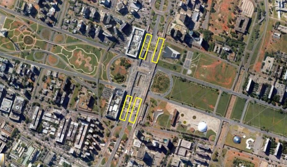 An aerial of the bus terminal and the four 13,000 sqm unused areas at each corner of the complex (in yellow outlines). (Map courtesy of Google maps)
 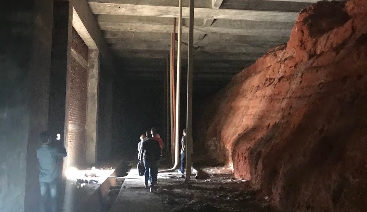 One of the void 13,000 sqm spaces, filled with compressed earth from the construction of the station. Source [1].
To develop a design proposal aligned with local needs, I carried out interactive research activities that engaged passengers on their way to the bus.
The interactive research activity simulated doors on the exterior wall of the void space, enabling pedestrians to “look into” the space and imagine its use. Visitors were intrigued and contributed feedback on proposed uses. Source [2], [3].
Through data collection and site visits, it became clear that pedestrian access and facilities at the terminal are extremely poor. Accessibility must be a priority for all mobility hubs because passengers need to move in and out quickly, and quality facilities make the passenger experience much more enjoyable.
The imposing exterior wall of the unused space (on the left, from Google Maps) at the site entrance contributes to poor accessibility and permeability. On the right, a proposed redesign that increases penetrable access and welcomes pedestrians. Source [3], [4].
The design proposal activates this previously unused structure and improves the pedestrian experience by creating new opportunities for foot traffic, optimizing pedestrian movement, and improving personal security.
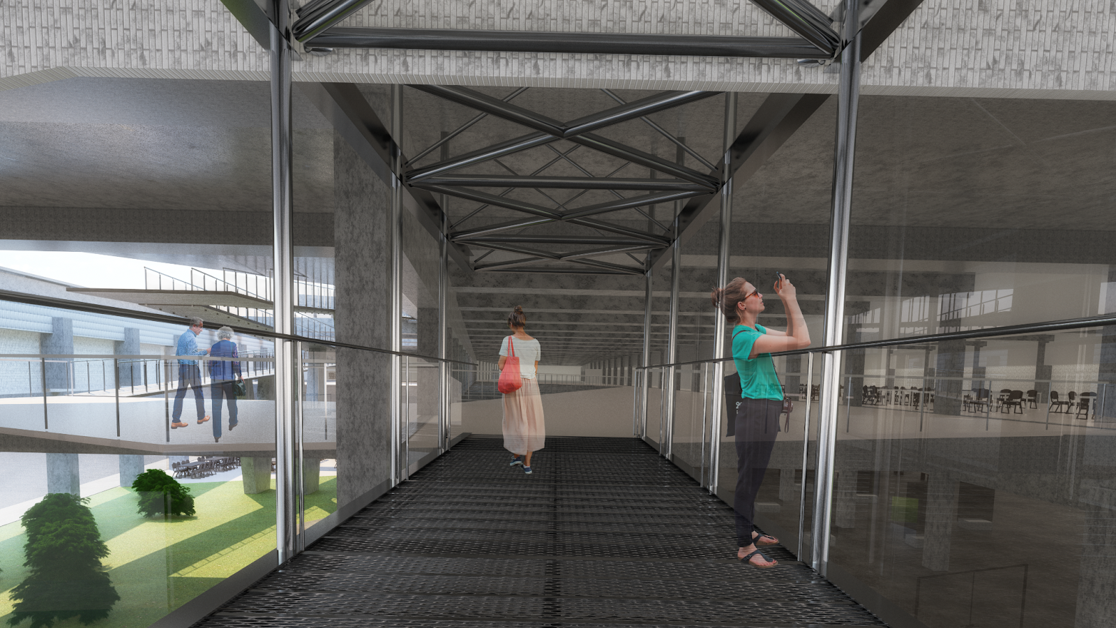 A proposed footbridge between the terminal and design site that would bring direct sunlight and air circulation into the space. Source [5].
By implementing a cut in the façade, natural sunlight would flood the space’s open floor plan. This open design reinforces the theme of free movement and permeability found throughout the urban design of Brasilia.
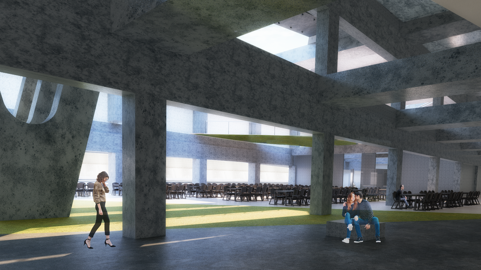 The unused space is activated into an open concourse, illuminated by abundant natural light. Source [6].
Uninterrupted pedestrian flow and movement also reinforces the focus on passengers, as does the addition of recreational spaces and amenities including coworking rooms, free workshops, wifi, quality waiting areas, and suitable furniture.
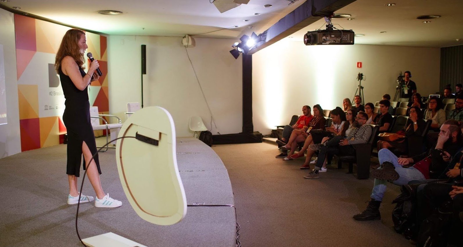 Ilana Zeigerman presents her project to Brasilia at the National Museum of the Republic, by invitation of the Bank of Brazil. [Picture from Ossobuco Facebook page and video presentation].
The huge, unused space in the middle of Brasilia’s city center was unknown to most of the public at the time of my research. There seemed to be some hope when my findings and proposal were published in Brasilia’s main newspaper and when I was invited by the Bank of Brazil to present at the National Museum of the Republic. Unfortunately, the space remains unused, but hopes to see changes in the future considering the high potential in architectural, urbanist and mobility terms.
Good architecture and design elevates the passenger experience. And that improved experience is crucial to increasing public transportation usage. So, when we think about passenger experience, let’s start with what happens before and after the ride itself.
Pictures Source [1], [2], [3], [4], [5], [6], [7].: Credit from Ilana Zeigerman
%20(2).png)
